
 Illustrating children’s books and taking criticism
I have always been keen to get advice and feedback about my illustrations from other than friends and family . . . who obviously marvel at my creative work. In search of more objective feedback, it is always interesting to quiz professionals in the children’s books industry.
Once, I talked to an agent and showed her the cover of The Sleepy Ladybird. She said that the children looked slightly oriental. This was an interesting comment but I won’t expand on it now. She also said that they looked too ‘cutesy’ for her taste. I love cute and endearing characters, but some people in the industry think it is a no-no and think cute is only for greeting cards.
Curious to hear what the top illustrators had to say, I went to a couple of seminars. One of them was with Chris Riddell, a superbly talented illustrator who started his career in children’s book illustration when his friend Kathryn Cave asked him to illustrate Something Else, a book about accepting differences and one of my favourites. His ‘doodle books’ as he calls them, were covered with ready to print drawings, no pencil marks or sign of rubber use. Amazingly, Chris’ pen stroke is always perfect first time round – or is this clever marketing?. Unfortunately I did not manage to squeeze through the crowd and talk to him on this occasion, so I was determined to make contact at the next seminar.
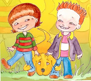 This was even more crowded with eager wannabe-illustrators and wannabe-writers and it was all about Tony Ross, the author/illustrator of The little Princess series as well as Horrid Henry, for young readers. Tony claims he produces one book a week, which is truly impressive. Clever marketing again? After his talk, which included a few sarcastic jokes about fellow colleagues in the industry, whom I won’t name here, and wanting his advice, I managed to approach him to show him my half-done-illustrations of The Sleepy Ladybird. Understandably, I was a bit nervous. When this happens, my French accent can sometime become stronger. He had a look at the drawings of Charlotte and Freddie and remarked, ‘They look French’.
Me: ‘All right, is there anything else you can see?’
Tony Ross: ‘They look like they have some kind of brain disease and their heads are about to fall off.’
Pause –
Me: ‘Oh really, Thanks.’
 Well, I did ask for ‘la critique’, didn’t I? Although it’s impossible to know if Tony Ross was being sarcastic or giving true comments – probably a mix of both – I took on board there must be some spec of truth in what he was saying. After all, I am just an insect compared to him. So, I seriously considered reducing all the heads. But then I changed my mind, deciding the heads were just right. I did touch up a few drawings but didn’t do anything about the French aspect . . .
. . . apart from removing the baguettes and berets.
As long as I keep my mouth shut, I thought, nobody will notice!
Next on the illustrator Blog is James Anthony Crabb who will be telling you all about the Dinosaur and Dragon Juice Café which is being printed right now, watch out for this one!
Lots of love and until the next time – Christmas I think.
Caro x
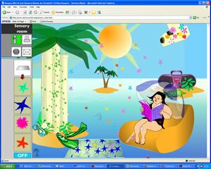 One of the favourite ‘rooms’ is the Sensory room, which can be fully customised to create a mood with a choice of settings, animations and music. Characters have been drawn digitally with a computer tablet and digital pen to create what we call ‘vector graphics’ using Flash software; the characters were then slightly animated.
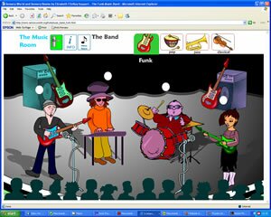 The most animated characters are located in the music room. You can get musicians from a band to play their instruments or stay still while the rest of the band is playing. When animating the guitarist, I initially just animated the hands and arms playing the guitar. Note that each animated element has to be drawn separately, on a separate level or layer and animated individually (for instance a hand or an eye would each be an element – think of Mr Potato Head if each plastic piece was animated and then assembled). Coming back to the guitarist, I realised I needed to give a slight rhythmic movement to the guitar to make it look more natural. The body also had to move slightly or the character would look too stiff. In the end, very few elements remained still – and this was nevertheless a very basic animation that had to remain minimal for quick web download!
 Kieron also made his grandmother Sally – who is not unconnected with Picnic’s distributors (!) – read and re-read it. Sally said what was fascinating was that for the first time ever, her grandson was listening to the story and checking out the pictures. He then insisted it be read again – and re-checked the pictures. Sally is wild about the book because she says children have no vocabulary but do have sophisticated minds, which children’s books do not exploit.